Kite House
Project Overview
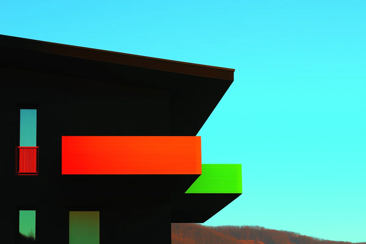
A visual identity for a small creative studio built around curiosity, collaboration, and unconventional ideas.
Kite House wanted an identity that could feel playful without becoming decorative, and professional without becoming predictable. The visual language needed to reflect curiosity and collaboration while remaining adaptable as the studio’s work expanded.
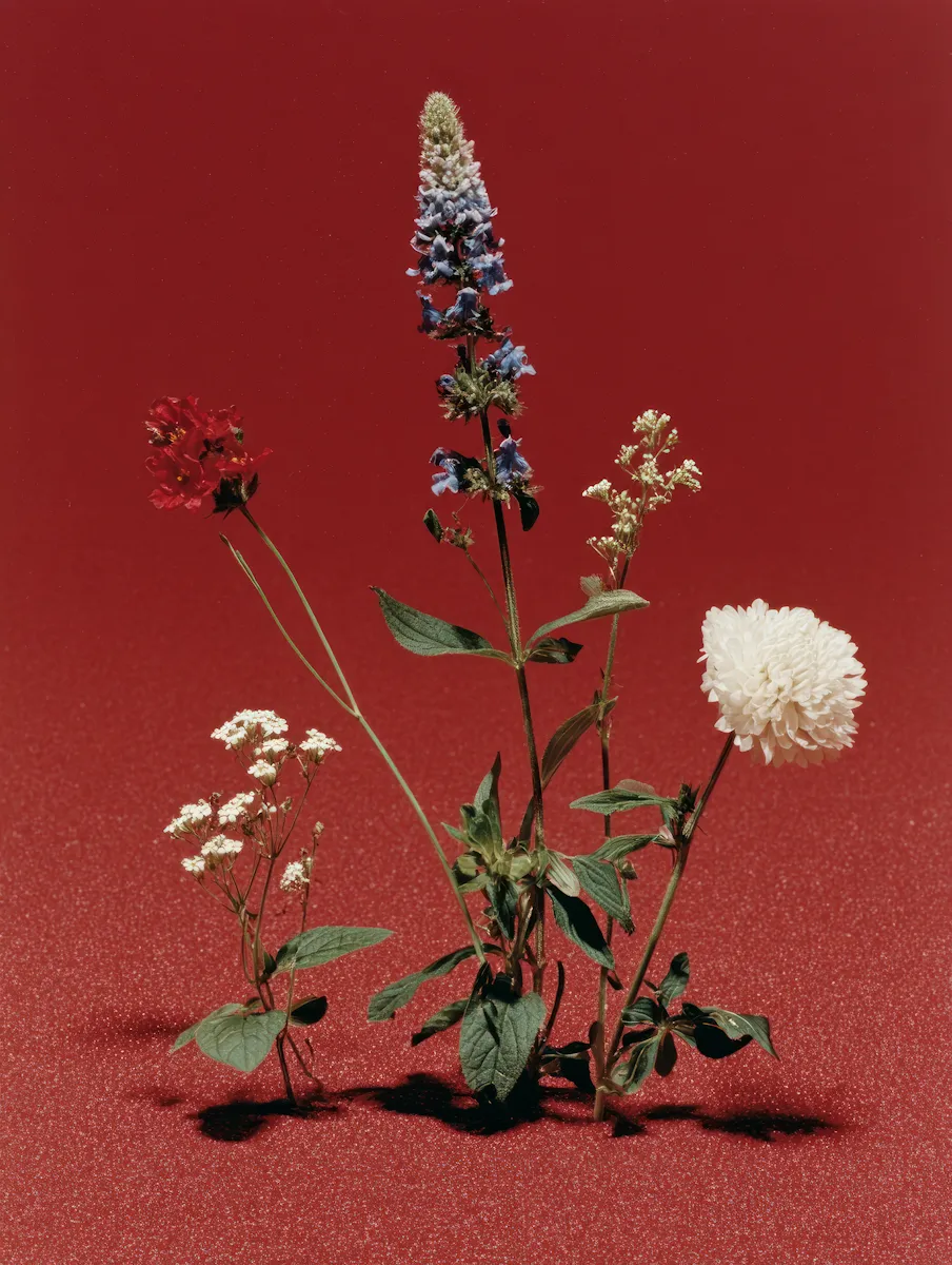
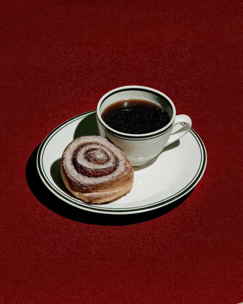
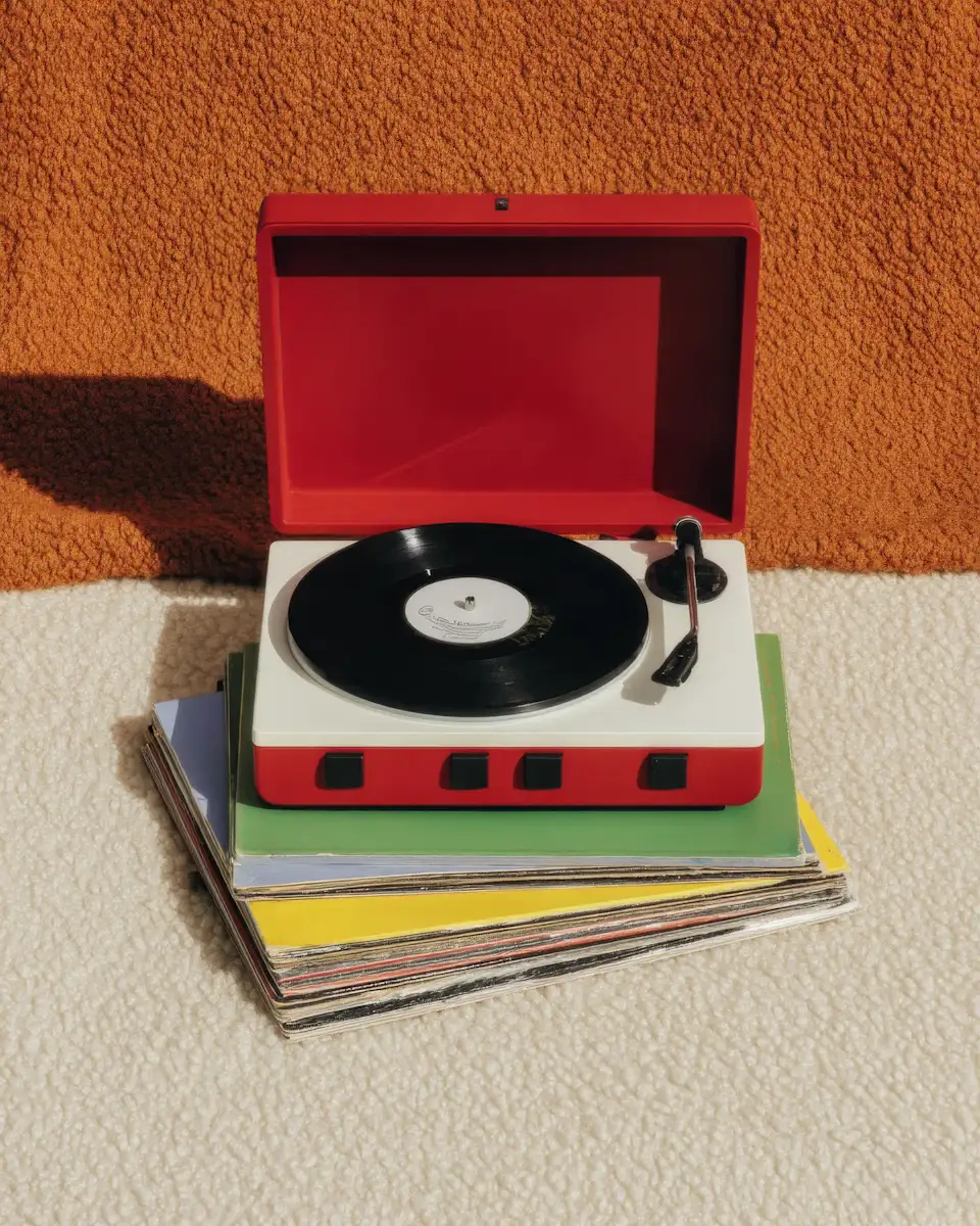
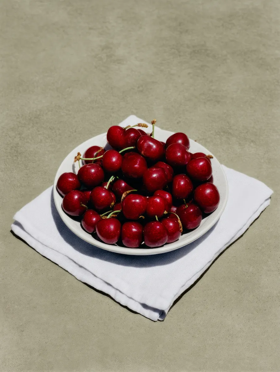
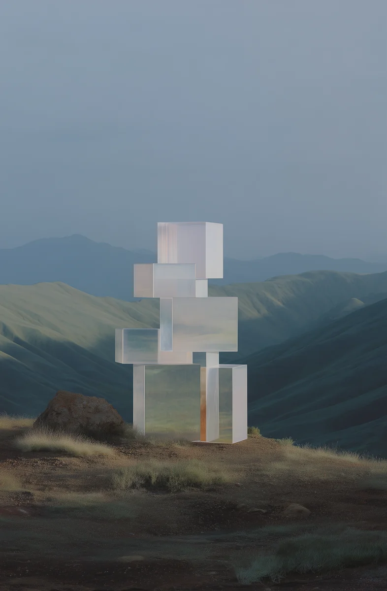
A flexible typographic system provides a stable foundation, while an evolving image direction introduces variation. Together, they create a framework that can shift between editorial work, digital experiences, and campaign applications without repeating the same formula.
The outcome is a recognizable identity with room to move. It gives Kite House a consistent presence across touchpoints while allowing the studio’s personality and ideas to keep developing.


Challenge
Approach
Outcome
The identity needed to balance a playful personality with the credibility expected from a professional creative studio.
A flexible typographic framework and evolving image direction provide consistency without repetition.
A distinctive identity that adapts across editorial, digital, and campaign applications.