Morrow Objects
Project Overview
A considered identity for an independent objects practice working between utility, material, and expression.
Morrow Objects needed an identity that felt precise without becoming sterile. The objects themselves were tactile and quietly expressive, but the existing communication leaned too heavily on function and did not fully convey their material character.
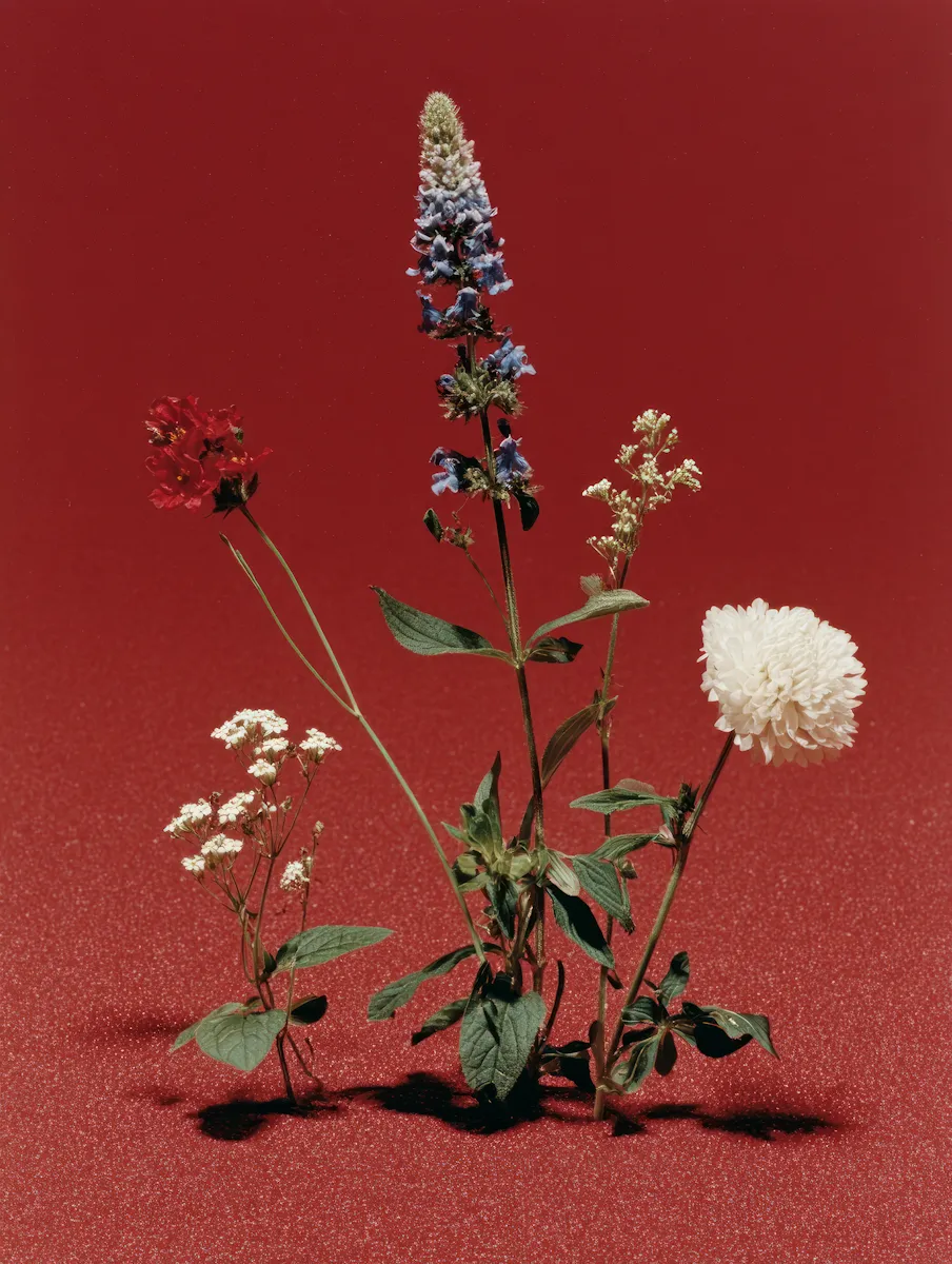
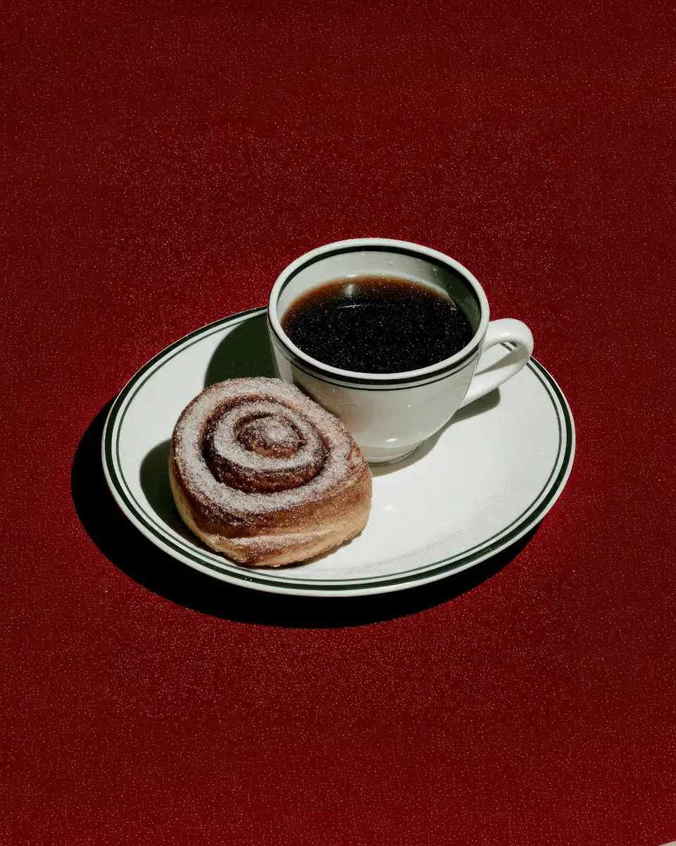
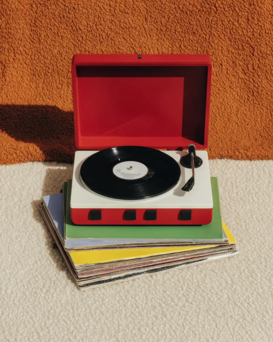
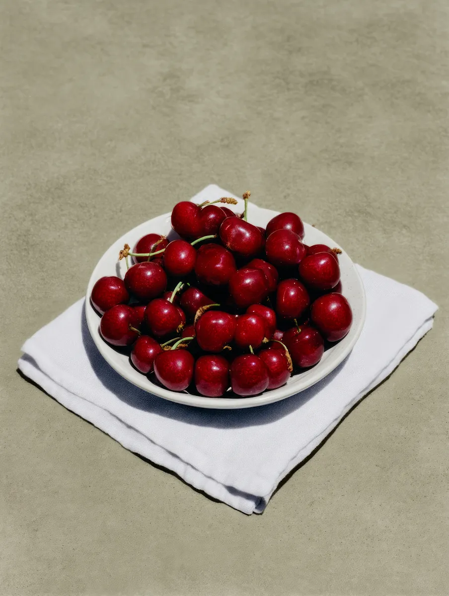
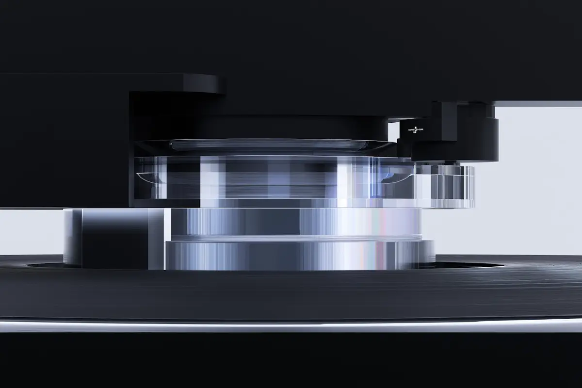
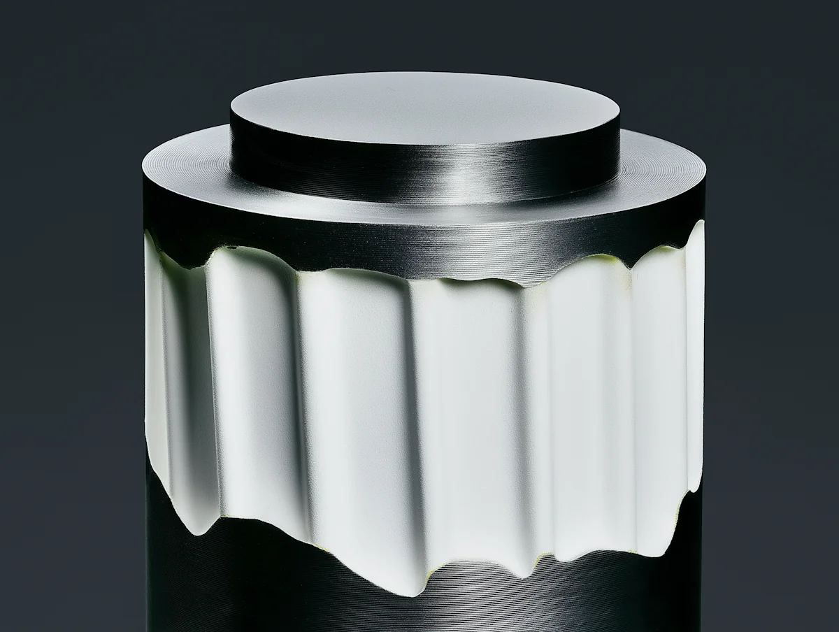
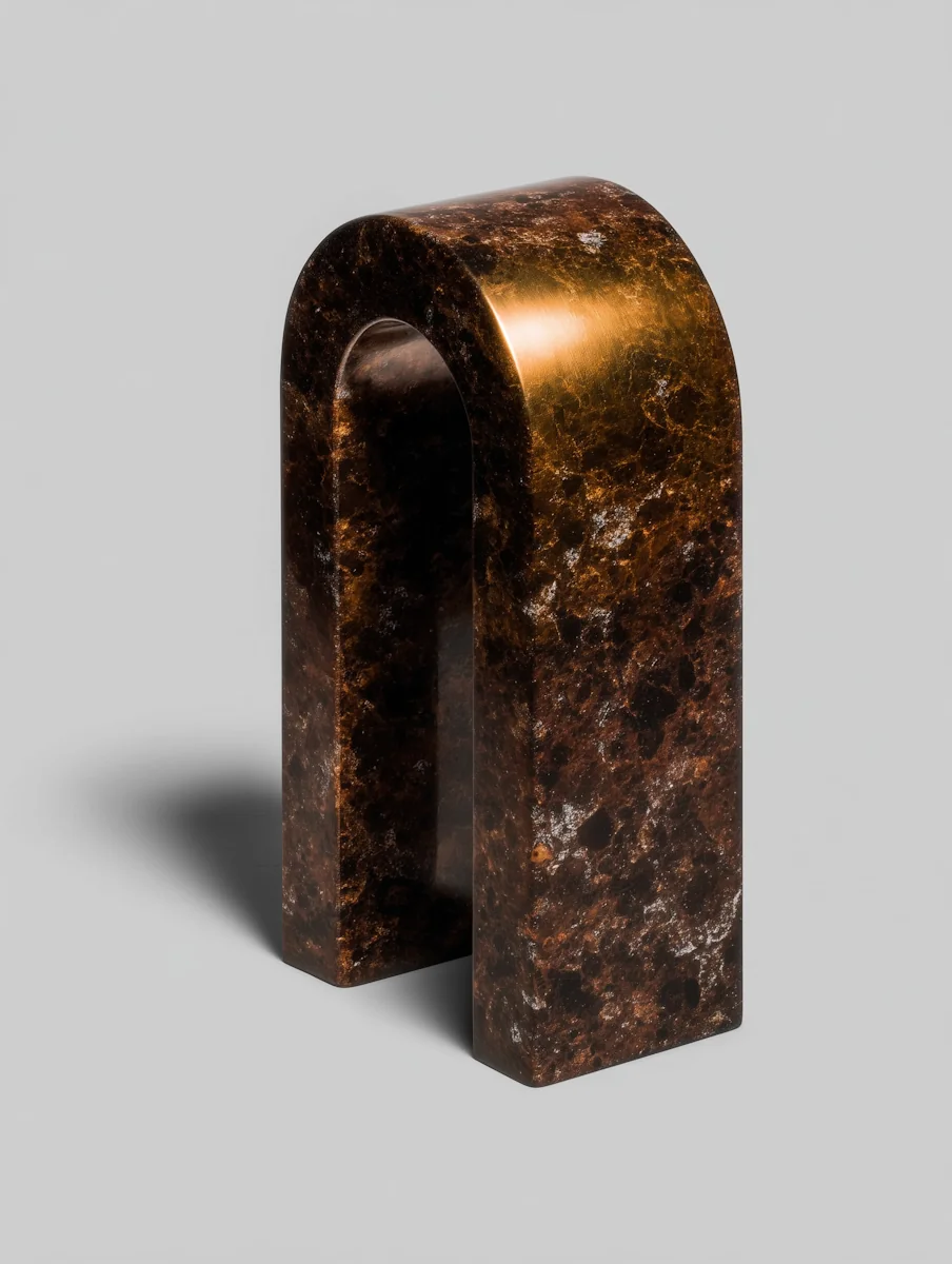
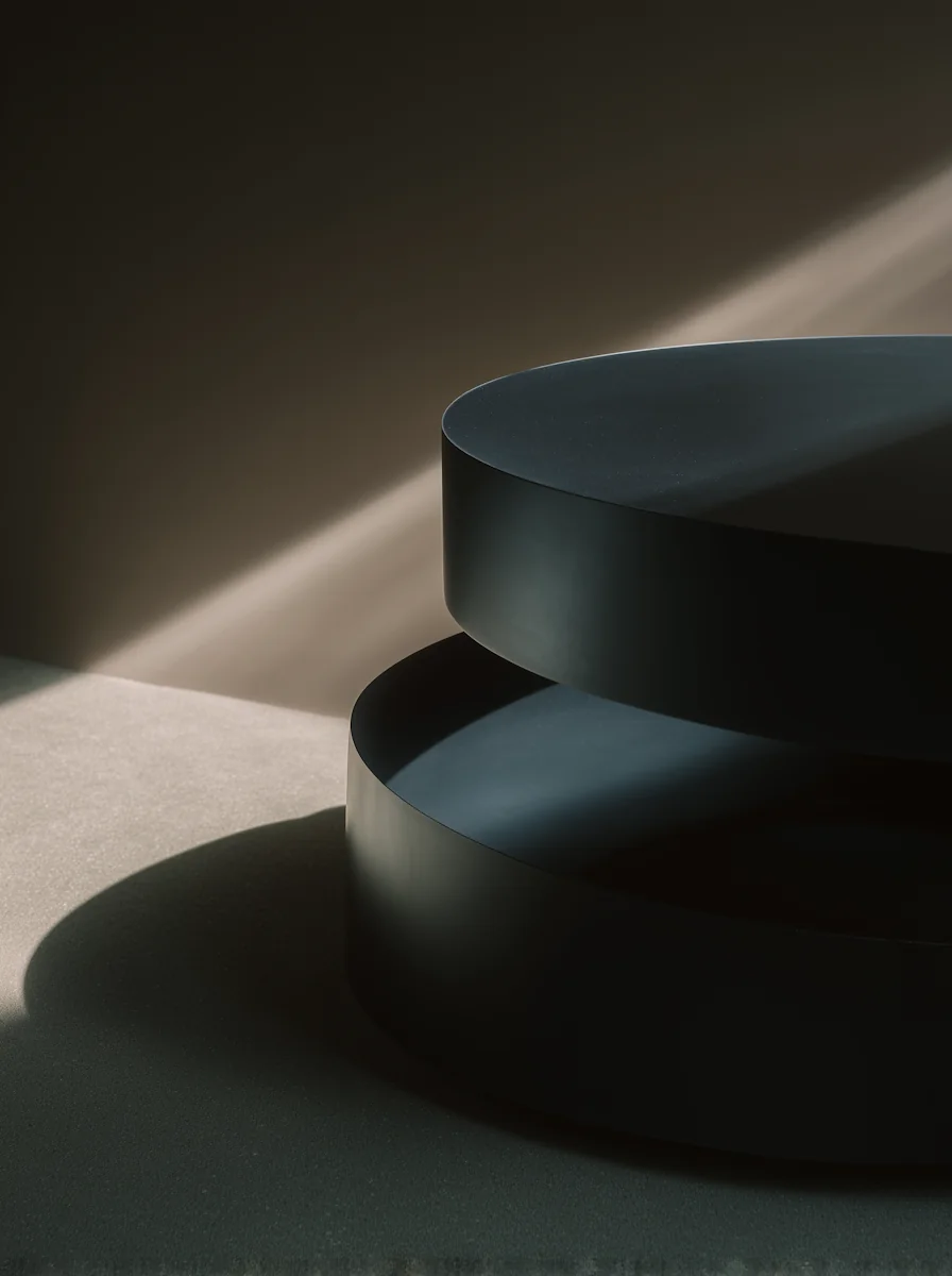
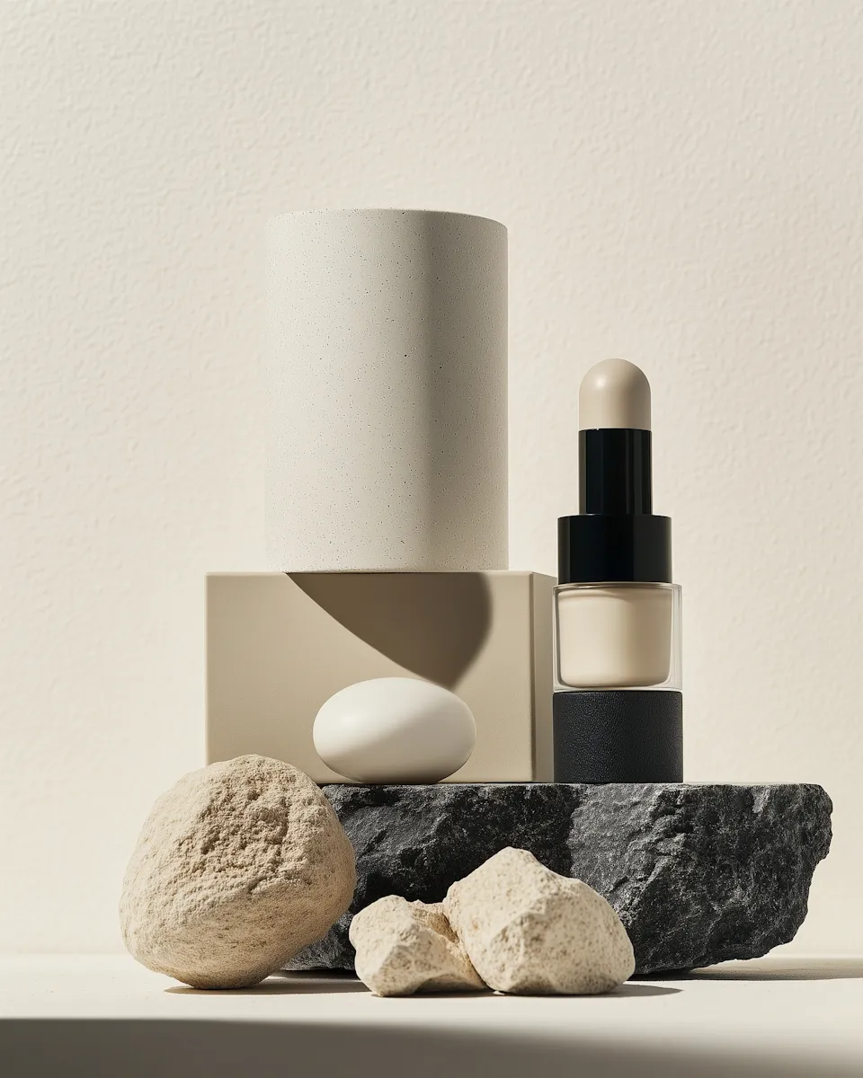
The visual system draws from material, proportion, and repetition. Editorial typography provides structure, while tactile photography brings warmth and makes the physical qualities of each object part of the identity.
The resulting identity moves across digital, print, packaging, and physical touchpoints without losing its restraint. Each application feels connected to the same visual language while leaving the objects room to remain the focus.
Challenge
Approach
Outcome
Morrow needed an identity that could feel precise without becoming sterile while preserving the tactile nature of its objects.
Material, proportion, repetition, editorial typography, and tactile imagery became the core visual language.
A flexible identity spanning digital, print, packaging, and physical touchpoints.